

Overview
User challenges: The process of seat reservation is incremental and can be done in many different ways. The main pain points that had to be addressed:
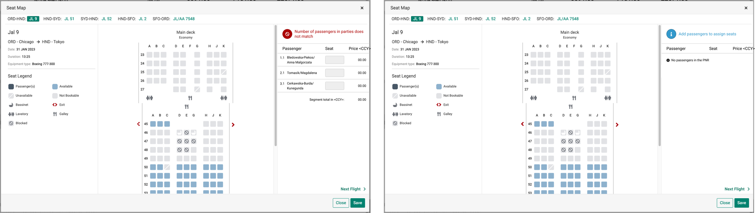
User doesn't know the status of seat reservation
User is not able to access error/warnings messages after navigating outside
Some messages are displayed like an error, while the user hasn’t done anything wrongly
The solution: Redesign seat reservation interaction to simplify navigation, give the user the proper guidance, indicate the status of the reservation, and provide access to system messages at every step of the process.
Research and discovery
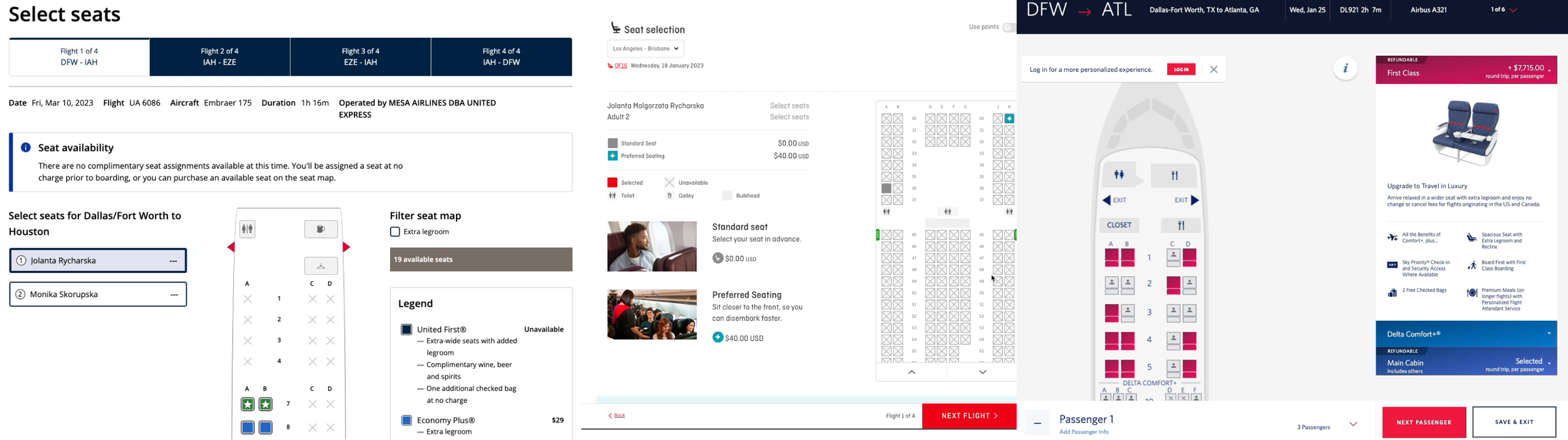
Point of sale application (system) audit
Competitive Analysis
Stakeholder interview
Point of sale application (system) audit
I have reserved seats in multiple configurations covering most common use cases and boundary conditions to better empathize with users. My findings are as follows:
a seat can be reserved in multiple ways at different stages of the itinerary booking process, e.g. before issued ticket/after issued ticket, initiated during pricing result screen or itinerary review screen, the user can reserve a seat to one traveler, and not to another
the system does not enforce seats reservation, also system does not force to do the reservation in the specified order and the user can jump from one flight segment to another and incrementally add seats
the system does not indicate if and which seats were already reserved when launching the seat map or when navigating between seat map screens - we do not see anything that would be a suggestion for what was done
the system displays a different kind of messages in different spots and I haven't seen any logic behind this
some system messages were misclassified, e.g. notifications were displayed as errors
texts of messages many times were very technical - not obvious for early users
keyboard navigation, which is a system requirement, was not always possible.
Competitive Analysis
I have reviewed the seat reservation process on several airlines’ websites and online travel agencies’ websites. In most of the reviewed cases users are forced to do a reservation accordingly with a flight segment order - some times switch goes automatically, and sometimes users can navigate using the next and back buttons. Warning messages were displayed in pop-ups or modal screens forcing user to acknowledge or act on them.
I got inspired by this idea, however, I knew that pop-ups or modals wouldn’t work in our scenario.
Stakeholder interview
I spoke with product and business analyst people to check what are their awaiting and find out about any other pain points they may have heard from the system’s user. Their observation covered some of my findings.
The good thing I found out while talking with them was that wording of the messages could be changed (improved)!
Regarding the warning messages - I found out we won't be able to distinguish which warning is to which traveler.
Brainstorming and ideation
Interaction design
Messages: new wording, categorization
Passenger list area
Interaction design
The seat map feature is currently modal-based, with each modal having a Save and Cancel button. This allows users to save or reject changes to their seat selection. However, the new interactions need to be global in nature. Additionally, success messages are not typically used to show the status of a seat reservation, so I needed to find another solution.
The interaction design I have created allows users to check the booking status of a particular flight segment at any time. The system will always display the status after the last changes have been saved. Additionally, clicking on the global Save button saves the changes in all other (currently inactive) segments. Error and warning messages will not disappear when they are saved.
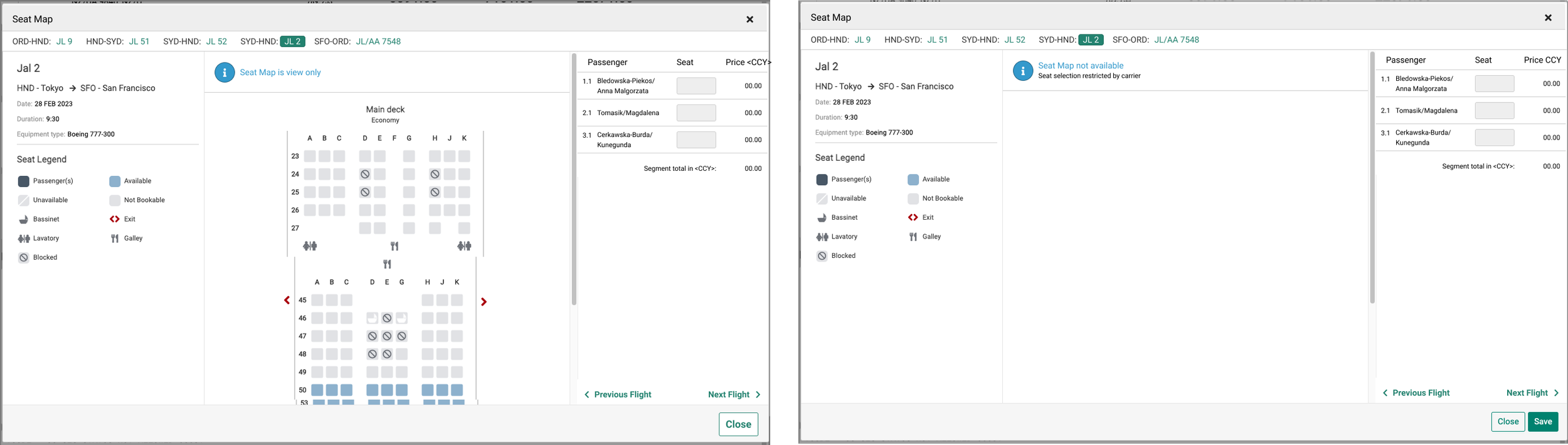
The new interaction design also takes into account that users can choose a seat from the seat map or type the seat number into a text field.
I have prepared the prototype and asked my teammates to try it out and provide feedback.
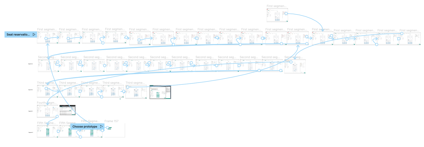
You can try the prototype by clicking on the picture.
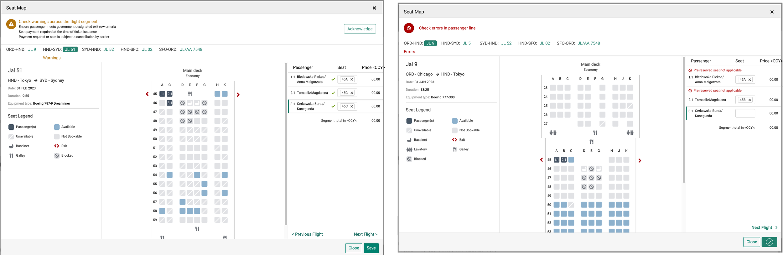
Messages: new wording, categorization
I gathered error/warnings/ info messages in one file. Together with product and technical product managers I reviewed them and got an understanding of what the messages say to the user.
My job was to change the wording to be better understood by each (also non-experienced user). New phrasing also follows new narration standards (short, clear communication, no words like "please").
Another topic that must be resolved around messages was to find the right place to be displayed. Working on phrasing and doing research, I have seen that we have 3 different categories of messages and we can split them into:
those that are related to the seat map itself,
those that are related to the passenger list or reservation possibility
those that show that something went wrong with the reservation.
Finding these categories allowed me to find some logic and made it easier for me to decide where particular messages should be placed.
Passenger list area
New interaction shows if the seat was reserved or not. As was mentioned before - we do not use a success message for this. Instead, I have suggested using the icons next to the text field with the seat number. Because of this, I had to think about a new design for the passenger area.
And that was great as the same I had an opportunity to introduce other improvements that allowed us to reach better consistency across the system and eliminate the accessibility issue around colors.
Design
In the last step, I gathered all the learnings and prepared hi-fi design. To save time a new design is done based on screenshots taken from the system. Components like flight segment navigation bar, table with passenger list were created using auto-layouts Figma feature.

Conclusions
The new seat reservation design is not yet implemented, but I am confident that it will be a vast improvement over the current solution. The new way of interacting with users using icons to show reservation status, (instead of disabled & working buttons used previously) mimics communication with users - giving them short information on what was wrong, why, and how we can fix this. All messages will be kept in the system so that users can refer to them later if needed.
Working on this design was a huge lesson for me about our product specificity - whatever we do we must think about translation in different languages as well as about the number of digits when we show prices in different currencies.