
Overview
Goal: New interaction & user interface design for web app used for booking sports activities in clubs
Role: UX & UI Designer, User Researcher
Tools: Pen/Pencil & Paper, Figma
Timeline: 2 weeks
Process: Research → Define → Ideate → Design → Test
Background
Book-game is a company that provides its partners (primarily restaurants and clubs) with an plugin (application)for making reservations for sports activities such as foosball, billiards, and bowling. They were pioneers in the Polish market, introducing their product in 2008. The product has not been updated since then.
The registration process is often confusing for users, who may not be sure if their reservation has been made successfully. Clubs and restaurants have reported that customers have arrived expecting to play, only to find that their reservation was not made.
In addition to providing a reservation service, Book-game also collects customer personal and contact information, which they sell to third parties.
Research and discovery
retrospective probing
competition research
meeting with stakeholders
Retrospective probing
To discover the main pain points, I asked five participants to complete the reservation process end-to-end. Two participants logged in with an existing account, and the next three registered for an account. In both scenarios, they were reserving bowling lanes (as this is the most complex task).
On questions about their experience, what they liked and disliked about the product, what was easy and difficult, and what they would change, I received the following feedback:
Poor navigation across the registration process - lack of guidance
"Tiny" font - sometimes hard to read
"Messy screens" - easy to get lost: "weird placement of data"
After login/registration, they have to choose the number of guests/lanes again
After registration, participants were lost if the process was finished, and they would like to see some confirmation
Overall, it "feels outdated"

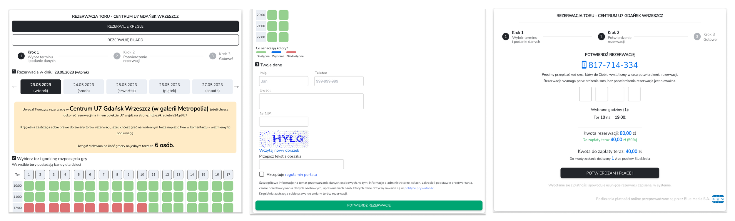
Competitive research
On the Polish market, Book-game has one competitor, kregielnia24.pl. I have checked their reservation flow and found that it offers a better user experience. The reservation is split into steps, which helps users to know what they are doing at each stage. At the end of the process, users receive confirmation that their reservation has been successfully completed.
To get some other inspiration, I checked several restaurants' websites to make online reservations for a table. I liked that the process was split into one activity on one screen. This made it easy to follow the steps and to keep track of what I was doing. I also liked that I could go back or start over at any time.
Meeting with stakeholders
The main insights from our meeting:
they care about the number of clients who mark yes on marketing consent
they want to expand their business and sell the plugin to new customers
Define
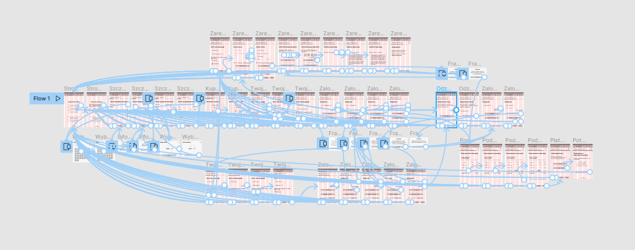
Interaction design - user flow
Interaction design - user flow
I moved toward the prototyping process. I created the user flow for the reservation process to see how the process might be arranged in a way one step on one screen. It helped me to think through each step and make sure the pages flowed smoothly.

Ideate
sketches
wireframes
mid-fidelity prototype
Sketches
The user flow showed me how many screens we would need. Before creating digital mock-ups, I decided to draw rough sketches. My focus was on what kind of details should be placed on each screen, especially in the scope of marketing consent. At this stage, I didn't care about the layout.

Wireframes
Currently, the plugin works based on mobile screen size - no matter the user's device. To save money for developing responsiveness - the new design was supposed to work the same way.
In my wireframes, I wanted to address all research findings:
we have information on what the user is currently doing
we show the progress bar of the process flow
one step per screen
additional guidance in the form of dialog /pop-ups
marketing consent is in one place
navigation button available on each screen
data we gather from users are presented on screen in the right order
Mid-fidelity prototype
To validate the interaction design, a prototype was required. I have tested the prototype with three participants. Their feedback helped me correct some minor issues.
You can try the prototype by clicking on the picture.
Design
Style guide & UI Kit
High-fidelity screens
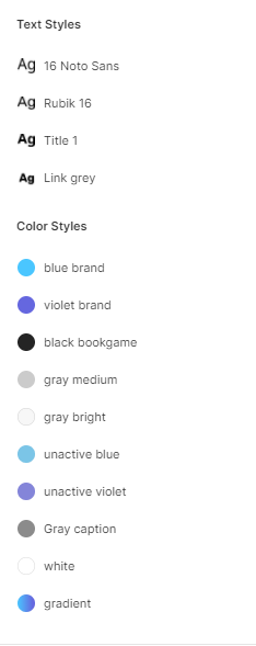
Style guide & UI Kit
I suggested to my client to create a white-label product - as they have an expansion plan and will be offering plugins to different new sports clubs and/or restaurants. The below example of design style is a continuation of the branding from the product landing page: www.bookgame.io
The components are prepared to be able to change color quickly. Everything will work with either one or two colors, depending on customer needs.

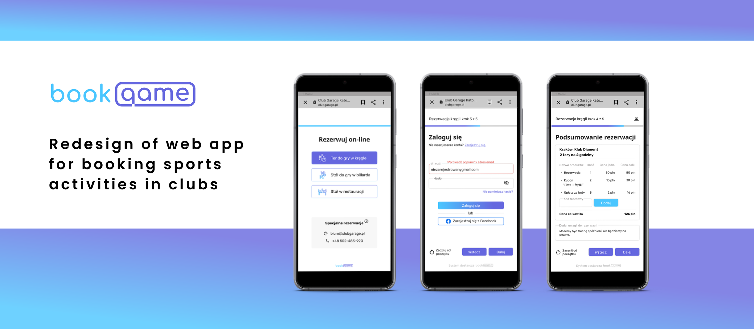
High-fidelity screens
Guided by my wireframes, style tile, and component library, I designed the screens in high fidelity. I paid attention to different states for text fields, so you can see empty, focused and filled-focused, filled, and also filled-error. Selected screens you can see below.


Summary
The process flow is a lot of interactions and system responses, so I hope the guidance I included along with the progress bar and navigation button will make the process smooth and we eliminate all user issues. I will be working on the rest of the screens and wrapping everything to hand over the project to the development team.