
Overview
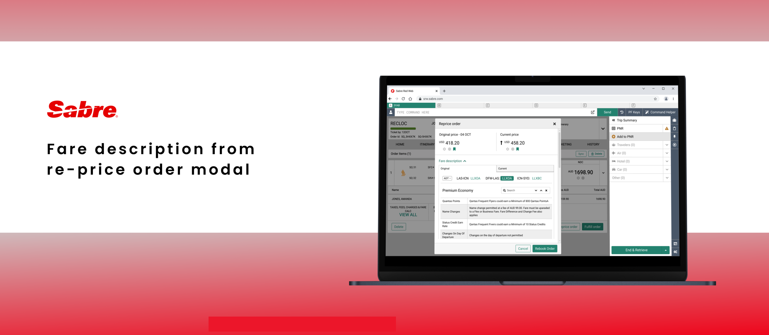
Project goal: Redesign the New Distribution Capabilities (NDC) order validation process to enable travel agents to compare product attributes (named as a fare description) of the existing order and current offer.
The solution: Provide a function that will allow travel agents to check and compare the details of the order that has been already created against the current offer.
Use recently designed and implemented fare description (brand attributes) modal.
Background
Offers for flight tickets in the NDC market can change frequently, not only in the scope of price but also in product attributes range. Currently, our users must go back and forth across the system to check the brand attributes description of the original order and the current offer. This is time-consuming and difficult for users to compare two sets of product attributes when they are not in one place.
Research
I began my work by conducting research on our application. The re-price order modal was straightforward, as it was the smallest modal we use in our application and we do not have much data in this area. Additionally, I designed the brand attributes modal in the past few weeks, so I was familiar with its specificity and functionality. I was able to quickly identify what we have and what solutions could potentially work for us.
Ideation & drafting
Mechanism
Brand attributes nested in re-price modal
Mechanism
The initial concept for the mechanism for summoning the brand attributes modal was a button placed in the footer of the re-price order modal:
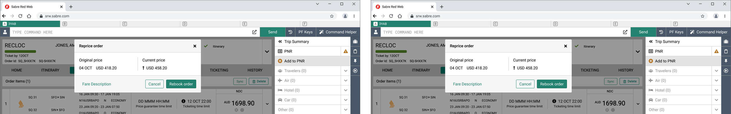
The initial concept was eliminated as it seemed strange to perform complex operations (such as browsing through flight segments) from a dropdown button. If the button would open a modal, this would result in two modals being opened one over another, which is unacceptable.
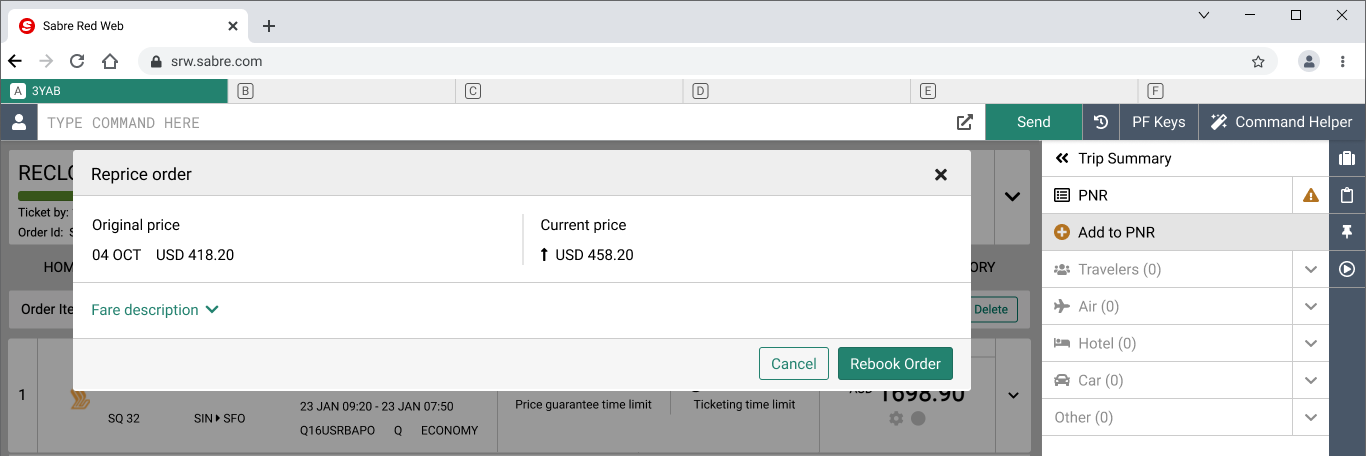
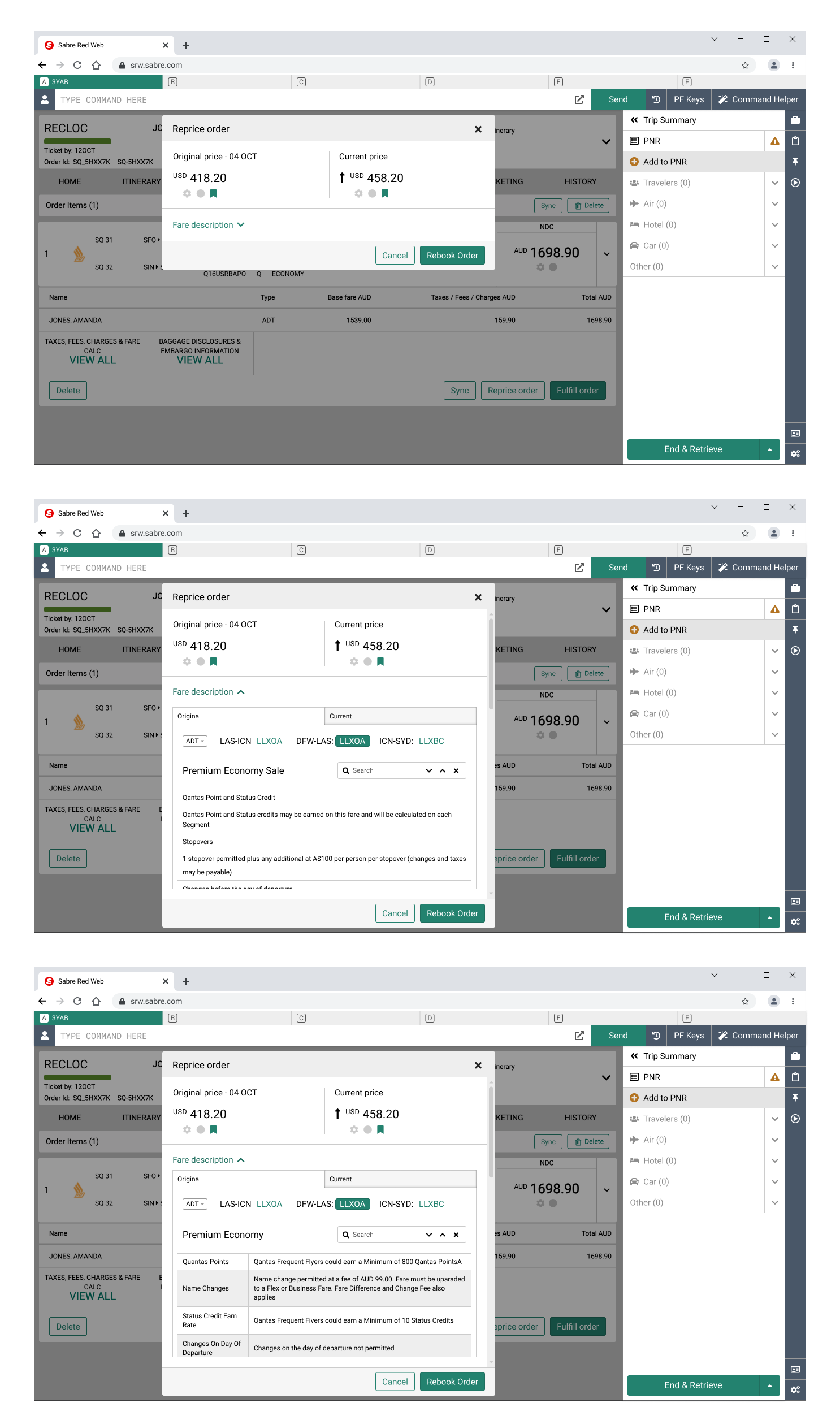
Another idea was to add a link to the reprice modal that would expand after being clicked to show data about brand attributes. This would require more space to compare what is included in the original and current prices, so I have noticed the reprice modal should be larger.
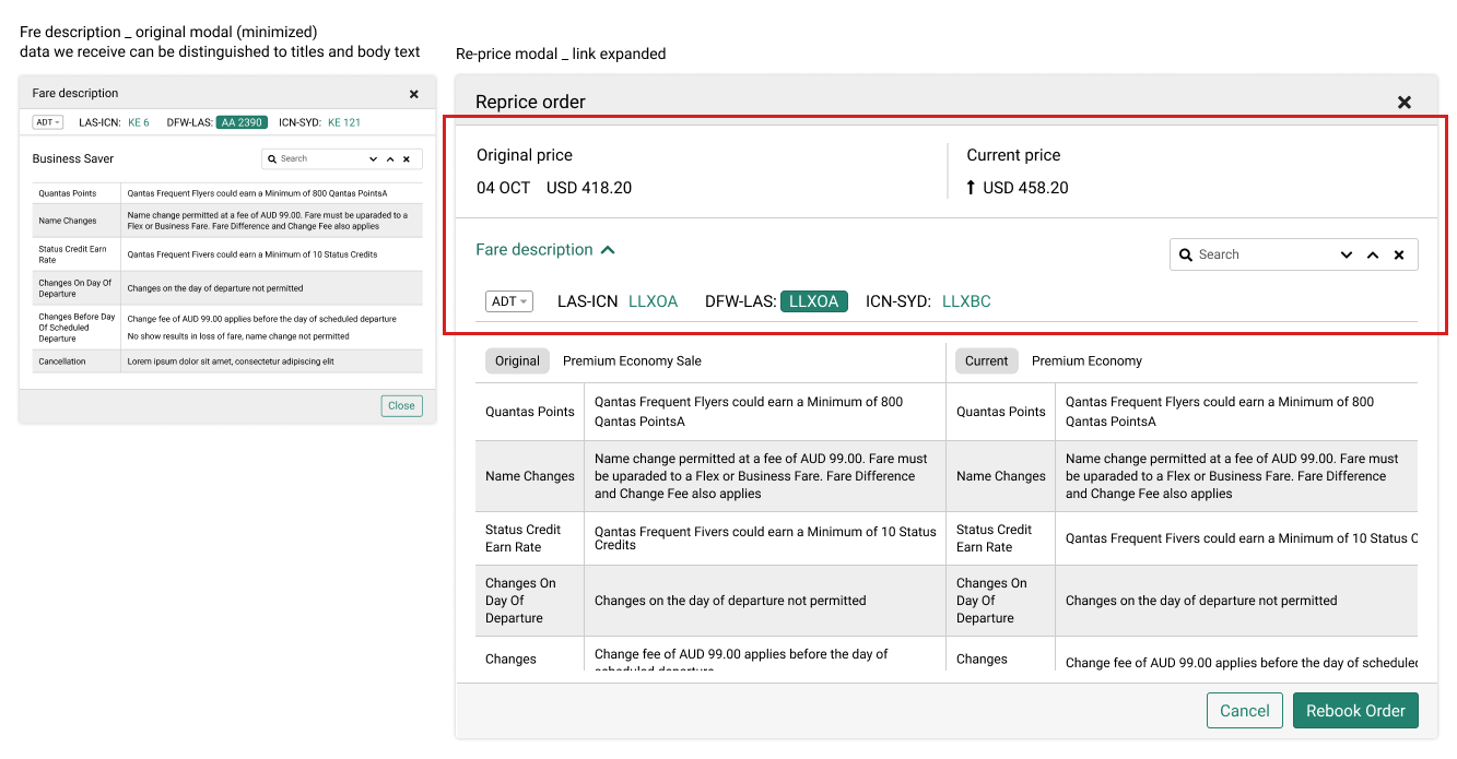
Brand attributes nested in re-price modal
Some elements, such as the flight segments navigation bar and search component, will be common to both the original and current prices. Therefore, my idea was to have the same top section, with fare attribute details in two columns beneath.
I was considering making the top section of the modal (in the red frame) sticky. This would be helpful for users when the description is much longer, as it would save them time scrolling from top to bottom.
Last verification
Upon further consideration, I have come to the following conclusions:
organizing sets of data we need to compare in two separate columns would be beneficial if the titles and descriptions of the original and current fare descriptions have the same order and length. However, I believe this is a rare occurrence that is unlikely to happen in real life. I confirmed with Technical Product Manager - Sabre does not control that data, so I decided we need to prepare for the situation where we have information about one topic in two different areas.
stickiness is also a desirable feature, but if the entire top section of the modal is sticky, users will have a very small area to browse or read the description
Final design
I decided to use two tabs, one for the original price and one for the current price. It allows users to read one description, switch to a different tab, and read another description. I also proposed a solution where the keyword entered into the search input box is preserved when moving from one tab to another.
Regarding stickiness, the decision was made to only make the flight navigation bar and search box sticky. This allows users to have a larger reading area.
We no longer needed the big space to present two sets of fare descriptions, so I replaced the large-size modal with the middle-sized one.
Validation and conclusions
The project was implemented and I have got aggregated feedback from our product managers that this new feature was very well-received by travel agents. They are happy that they no longer have to go back and forth to check offer details, but have everything in one place. This is a significant time-saver for them.
Finding a good design in a situation where you cannot control the data you receive is an additional challenge in user experience design. This is a common occurrence in SR 360, so I have learned to take a step back and consider the worst-case scenario: what if I receive terrible, messy data? This example showed me that sometimes it is better to design a solution that may not be the best user experience at first glance but will work in every scenario.