
Overview
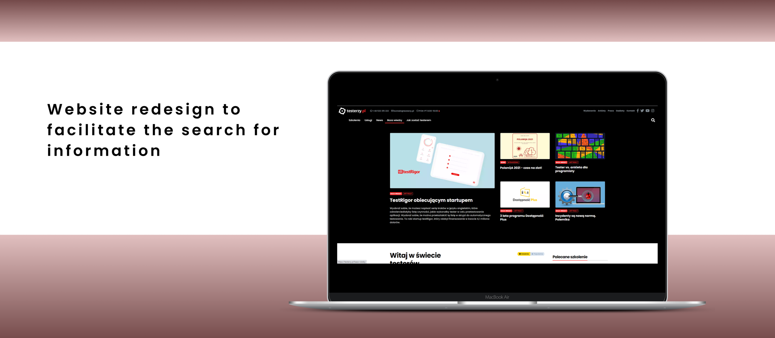
Goal: Facilitate the search for information on the website for people who are beginning to explore the topic of software testing
Role: UX Designer
Tools: Pen/Pencil & Paper, Figma
Process: Research and Discovery -> Define -> Ideation
Background and the challange
Testerzy.pl is a portal that provides knowledge about software testing, especially for those who are knowledgeable in testing. Their website is also visited by those who are new in the industry (or even interested in transition into software testing and become a tester) and therefore they receive a lot of inquiries, like 1. How to become a tester? 2. What training for novice testers? 3. What is software testing?
The feedback from visitors who are new in the industry is that on the webpage is a lot of different content and they don't know where to look for the basics of software testing.
Portal wants to serve all kinds of their visitors. They are looking for an idea of how to reorganize the website, keeping in mind very low costs and small effort to do this change.
Research and understanding
Webpage audit
I started my work with a webpage audit. At first glance, to me, this website looked like a compendium of knowledge indeed. After taking a closer look at the content of the website, it was possible to recognize that on the website we can find content also for 2 different company's domain: sale of training and software testing service offering.
So the site connects supposedly 3 different businesses and while browsing the site it was visible.

Homepage

Sale of trainings

Software testing service
Stakeholder’s expectations
I spoke with the client to understand their goals for this redesign. The main purpose was to properly serve webpage visitors and decrease the amount of email/phone inquiries they have. At the same time, they don’t want to resign from a model where they are an expert in knowledge in testing first of all. I have found out also that this is a company model of business, where, first of all, they offer free knowledge and later on, some percentage of website visitors come back and become company clients, by buying training or by using their testing services.
Limitations and constrains
Existing site information architecture - I could not change any of the other pages or flows across the rest of the website
The necessity to sign into the existing design system
Very low budget for changes
Ideation
Now that I had a solid understanding of the problem and what is the main purpose for changes and what are our contrains, I started to begin the concepting process. I have prepared 2 completely different solutions:
Solution 1st - Hero section
Make a hero section on the homepage - a photo/graphic/ video with a slogan and CTA buttons. The rest webpage content could stay in shape like it is. With this solution company could start using the webpage as a sales tool too, being at the same time a knowledge compendium.

First option: hero section is a slider composed of 3 different images and 3 other slogans and each has its own CTA button.

Second option: hero section is one graphic, one slogan and 2 different CTA buttons. These 2 buttons are the essence of company activity.
Solution 2nd - new tab in navigation bar

This solution assumed adding a new tab to the navigation bar with the title "How to become a tester" and creating a new subpage strictly with information on this topic. This solution potentially could be faster and more straightforward - and a new subpage could contain answers to all potential questions from people new in the industry in one place.
Decision
I presented two of my solutions to stakeholders and we had discussions about the advantages and disadvantages of each of them as well as about how much labour needs to be put to make a redesign. Ultimately client made a decision about the implementation of Solution Second.
They decided to implement the idea by themselves without a project. They created the first version of the "How to become a tester" subpage in line with the existing website interface. The first version came back to me to be commented on. Using paper and pencil, I made a sketch to show how to better (more legibly) present the content on the new subpage. On the second iteration, I gave my comments, too, but only some of them were implemented.


Results
After the implementation of the solution, the testerzy.pl portal recorded a significant decrease (90%) of e-mail and telephone inquiries in connection with the steps on "how to become a tester" and also noted an increase in interest in training for novice testers (7%). The new subpage fitted into the existing website interface, at the same time taking a step towards a better change - the distribution of content on the website with margins.