Overview
Project goal: The goal of this project was to extend the NDC (New Distribution Capability) reservation process with the display of hidden stop information.
Solution: New design that shows hidden stop information in a standardized way across all screens of the reservation process.
Background
Till now hidden stops were shown only on the shopping results screen. This information is very important to be displayed on other screens as well. Some countries' regulations require passengers to provide or have special documentation (eg. visa) even if the stop there is for an equipment change only. The travel agent's duty is to inform passengers about those requirements.
Research and understanding
System audit
Competitive Analysis
System audit
I started my work by exploring the workflow of the flight reservations (including issuing and/or changing the order or maybe the ticket). My observations are as follow:
regular stops trigger a separate flight segment with all flight details shown separately as a flight segment
flight cards are full of information and there is no space to add anything else
on the shopping result screen we can see hidden stops like an empty dot on the arrow - but details on the tooltip about this stop are misleading (full dot instead of empty)
on shopping results smaller screens we lose the arrow with dots, and the information about stops (only normal) is given like text - we do not inform at all about hidden stops
rresponsiveness of the shopping results screen (flight cards) doesn’t work perfectly
Competitive Analysis
I have checked several airline websites on how they present data about hidden stops. Some airlines do not inform at all about “hidden stops”, while others give detailed information with the guidance that entering country requirements must be checked. I have not found a solution that would work for our system, but it was good to look for some inspiration.
I am including research findings for review.
Ideation
Shopping results page
One pattern for all screens?
Shopping results page
I started my work from the shopping results page. I gathered different size screenshots and was looking for a way how we can improve the data layout there to be able to show hidden stops even on the smallest screen. By the occasion, I wanted to improve the responsiveness of this screen and change the layout of the data shown in flight cards (to be able to give to the user as much data as possible on each screen size).
It appeared we are able to use an arrow-dot pattern on each screen size, that was a good sign!
One pattern for all screens?
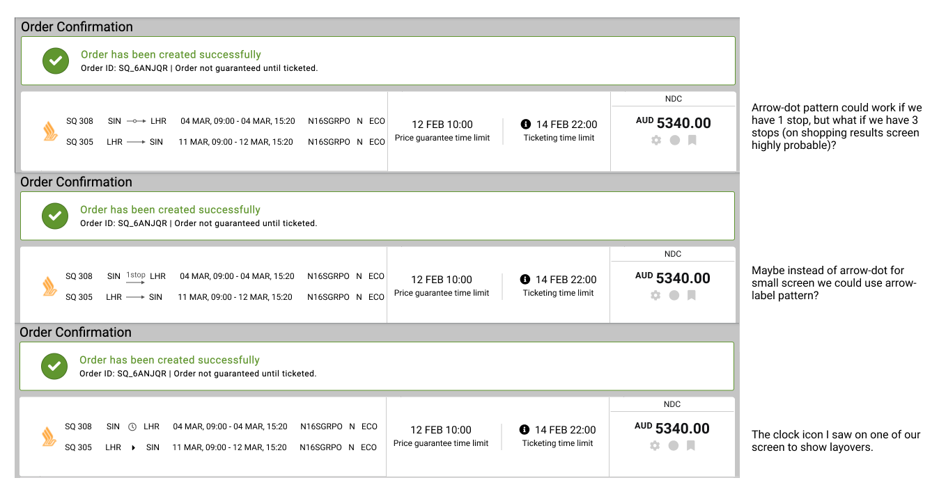
I discovered that we sometimes have three stops in one flight segment, which was a significant change. I was unsure if the arrow-dot pattern would still function for small-screen devices and the other screens from the flow. As a result, I decided to explore alternative options
Review and revision
A small arrow would not be ideal for more than one stop, and a clock icon does not look good with the caret icon below. At first glance, an arrow with a label might work, but what happens if we translate this to a different language, such as German?
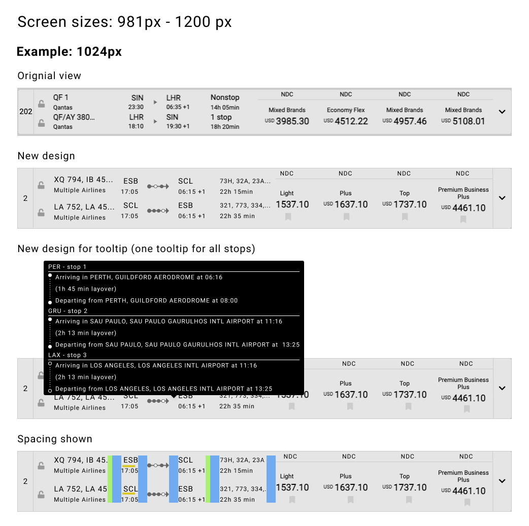
The most important question to solve was how to show three stops on small screens. I had to find a compromise and ended up with an arrow in two sizes: a long one used only for the shopping results screen (large sizes) and a short one for the rest of the screens. For the short arrow and more than one stop, all data about stops will be presented in a tooltip.
Design
Two arrows
Shopping results screen
Screens for flow
Two arrows
IIn many places throughout our application, we use the caret icon to show the direction of a flight. So, if we are in a situation where we will be making changes to the arrow, I thought it would be a good idea to maintain consistency between the arrow and the caret icon. I created an arrow with a triangular arrowhead, which is the same shape as the caret icon.
Shopping results screen
The final design for the shopping results screen I grouped into three categories based on the size of the screen.
Screens for flow
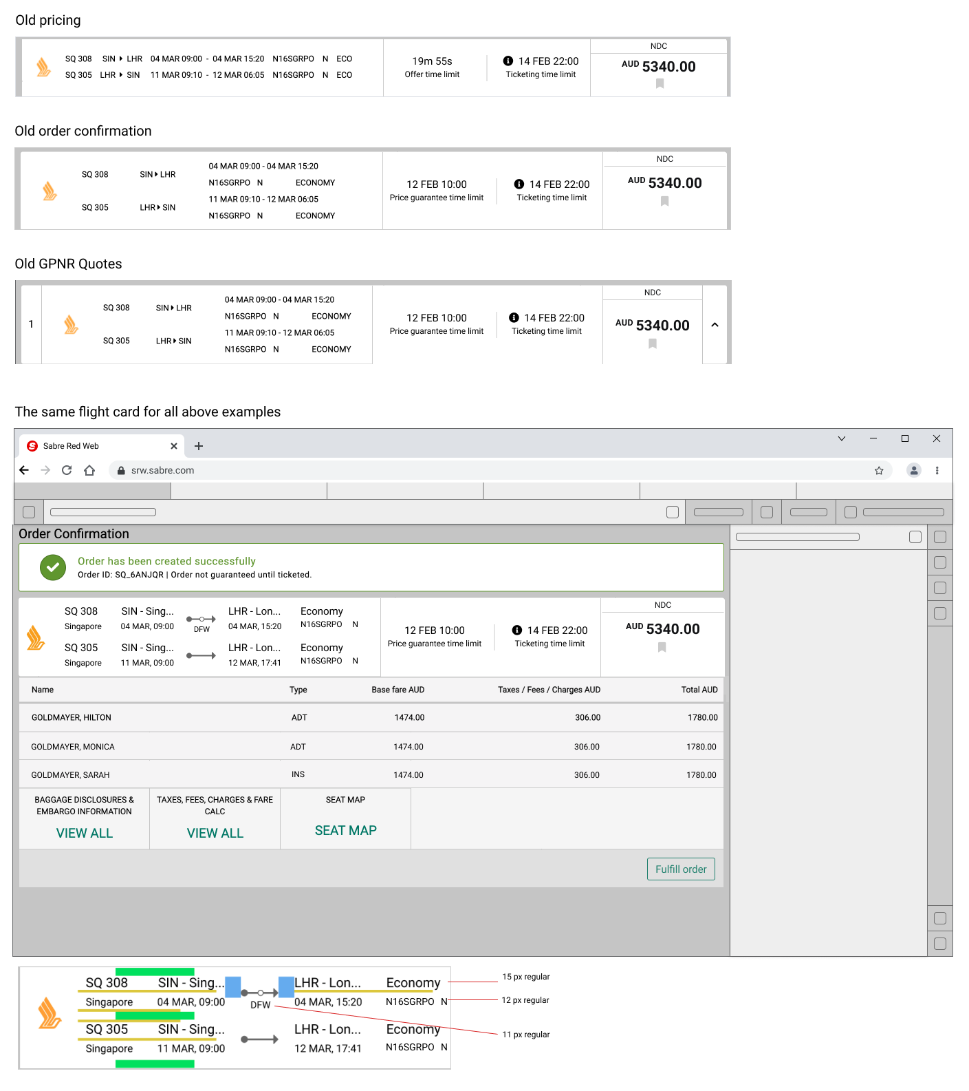
On the occasion of changes, I did some other improvements on the screens from the flow. I have included one example to look over.
Summary
We are introducing a feature that was waited for a long time. Information about hidden stops will be displayed on each screen from the task flow. That new feature will make it easier for every single travel agent to inform passengers about country entry requirements, helping them to avoid (sometimes) costly mistakes.
When I worked on this project, I convinced myself again that it is worth using an occasion and improving usability whenever it is possible. I am conscious that between this approach and scope creep, it is a very tiny line, that can be very easily broken. I see that experience and product knowledge have enormous meaning to be able to recognize what will be easy (cheap) to fix and what is better to qualify as a new project. I constantly learn this and also I am in touch with product and development people to discuss doubts with them.
Work on this project had some additional difficulty - we recently made some other changes on some screens that were not implemented yet, so I had to operate based on mocks instead of actual screens - so it was a lot of time-consuming patchwork for me.


