Overview
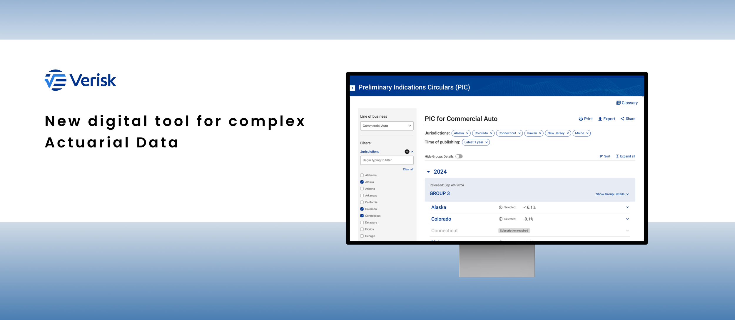
Project goal: The purpose of this project was to create a digital tool where Verisk users (actuaries and underwriters) could access and get on demand / filtrate/ export/download data from Preliminary Indications reports. New Prelimanry Indicattion Center should attract more clients and increase company revenue.
The solution: Information architecture and screen flow for Preliminary Indication Center tool that allow users use data from Preliminary Indication Circular in more efficient and user friendly way. Interface must be in line with WCAG 2.1 and Enterprise Design Language.
Background
Verisk Analytics is undergoing a digital transformation, migrating its product suite from PDF-based formats to a fully digital experience. This involves the development of a new, unified platform and the gradual migration of existing products onto this platform. Simultaneously, Verisk is refining and expanding its enterprise design language and component library to ensure consistency and a cohesive user experience across all digital products. The Preliminary Indication Center will be one of the key digital tools accessible within the Actuarial Hub platform, enhancing the user experience and workflow for actuaries.
Research and discovery
Preliminary Indication Circular vs Lost Cost Report
New Verisk’s platform audit
Preliminary Indication Circular vs Lost Cost Report
Verisk conducts annual Loss Cost Experience Reviews for each major line of business (LOB) by jurisdiction (state). To streamline this process, jurisdictions are grouped into four cohorts, with each cohort undergoing a loss cost experience review on a quarterly basis. These comprehensive reports are then submitted to the Insurance Services Office (ISO) as part of the regulatory filing process.
Before loss cost reports are being submitted to the ISO, Verisk releases a Preliminary Indications Circulars (PICs) that indicate ~ 90% of the information (data) from full experience review circular and provides initial information about a potential insurance product or coverage.
The purpose of the PICs is to release information to actuaries sooner, so they can plan/act while the filing process is finished and official loss cost reports are published.
New Verisk’s platform audit
I conducted a thorough review of all Verisk products successfully migrated to the new platform. This analysis aimed to identify recurring patterns, mechanisms, and reusable components within the existing user interfaces. Since no central repository for such information previously existed, this review was crucial for me. Several solutions discovered during this process appear to be promising starting points for the design of the Preliminary Indication Center (PIC) interface.
Brainstorming and ideation
Information architecture: state groups and line of business in circulars
Group details and cover letter information
Navigation details
Two logics of data agregation
Groups and Line of Business in circulars
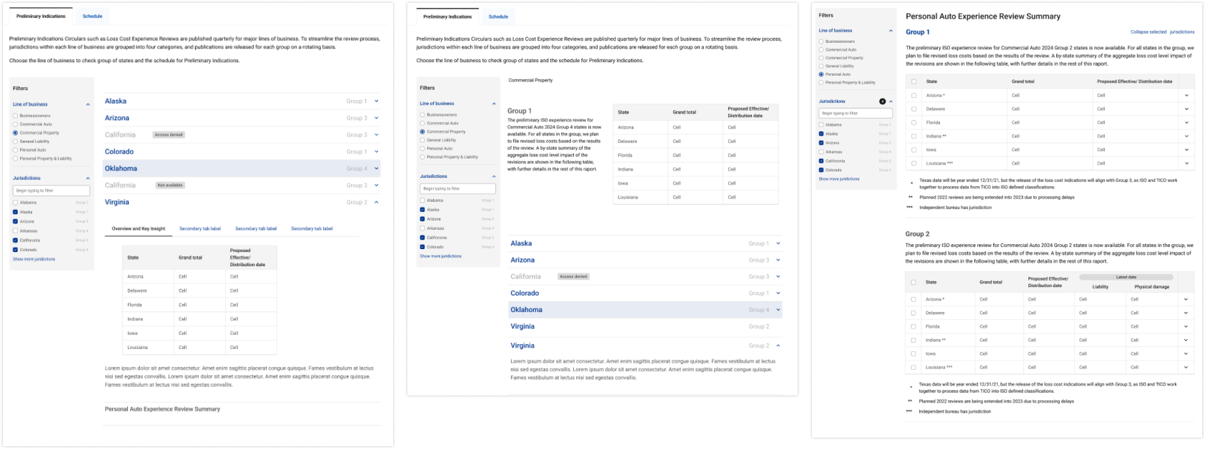
My work I started from looking for proper information architecture. Data organization and way of filtration has to answer assumption that PICs look different in each line of business and also in each line of business we have different set of states. I drafted a lot of versions along the way. Some of them are below:
Group details and cover letter Information
During the initial review with the product team, I gained valuable context: the group assignments for states may vary annually. While this is not a frequent occurrence, the interface must be designed to accommodate this dynamic.
The existing PDF-based Preliminary Indication Circular (PIC) lacks a summary section that provides context to users regarding the data and its implications. This crucial information, such as key takeaways and insights, is highly sought after by users. By incorporating them, the company anticipates a significant increase in PIC usage, currently at only 30% of loss cost reports users.
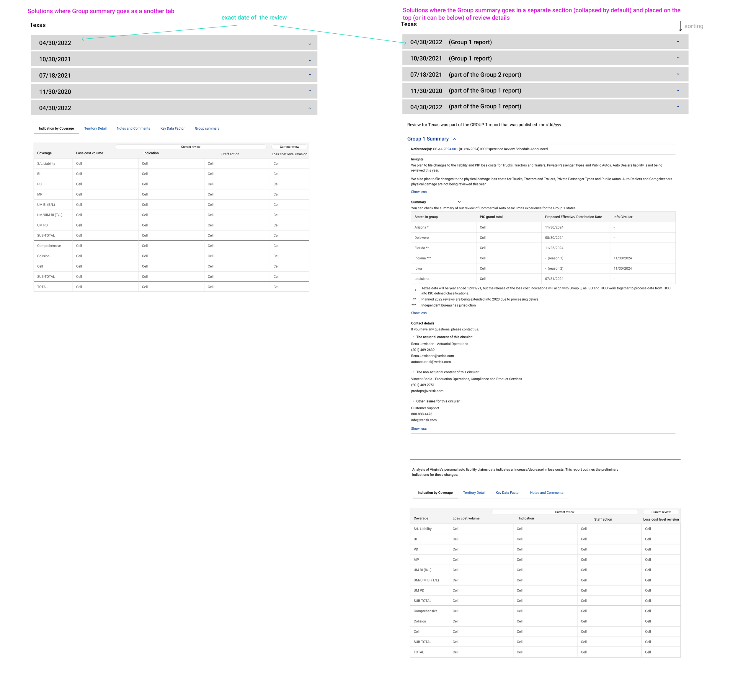
In the current PDF version, the cover letter is a separate attachment. Certain critical pieces of information from the cover letter, such as data quality, product authorizations, and other relevant details, must be seamlessly integrated into the digital tool. I received specific guidance from the product director regarding this integration and have subsequently created a board to visualize these concepts.
Navigation details
The PDF-based report is data-intensive, and the digital version must also incorporate several descriptive sections. To ensure optimal user experience, the interface have to have a well-designed navigation system that allow user to focus on specific information (based on current need).
Two logics of data aggregation
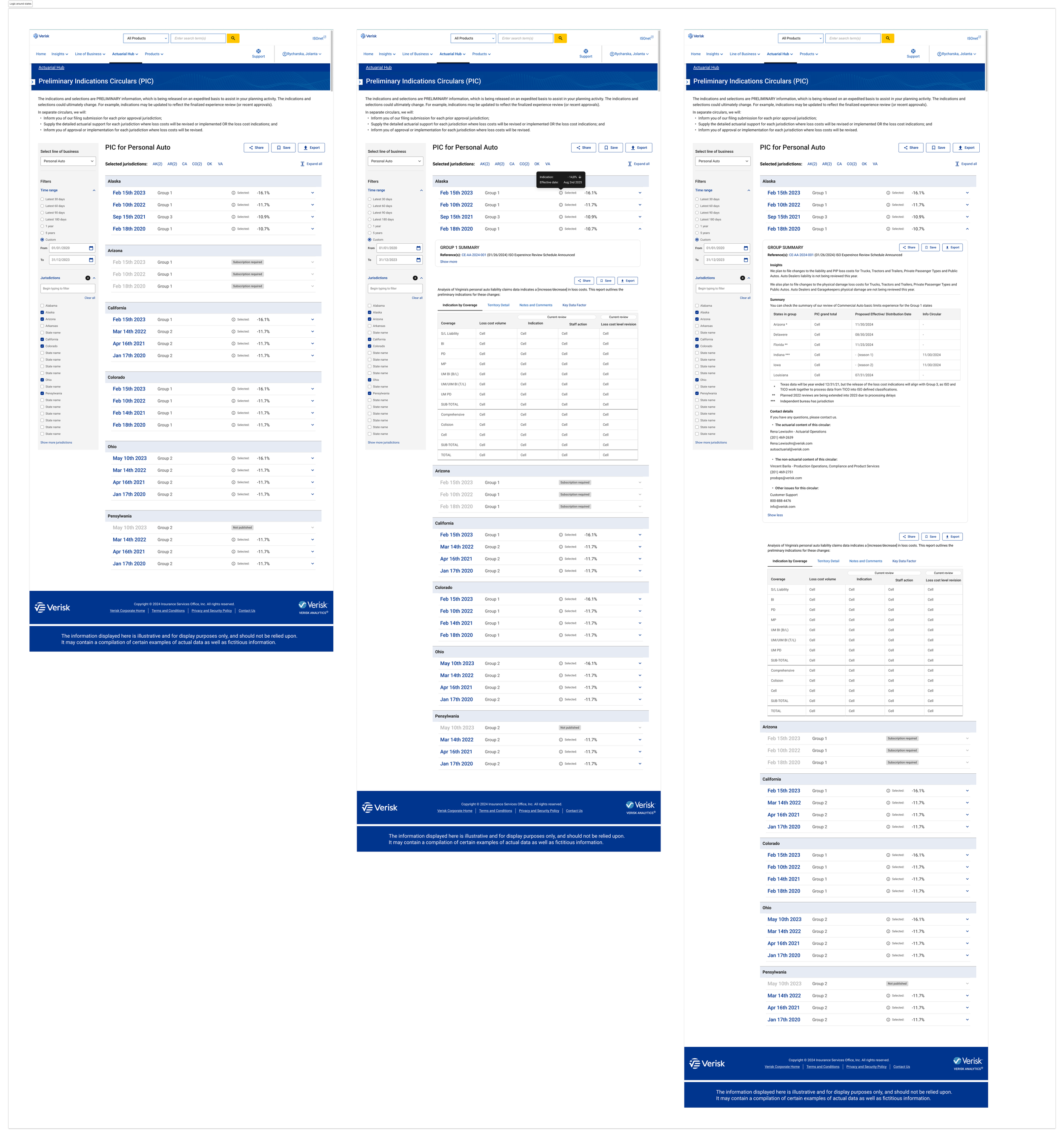
During the design process I came up and sketched an idea of organizing data around the particular jurisdiction. This could allow users to analyze and see the trends for state.
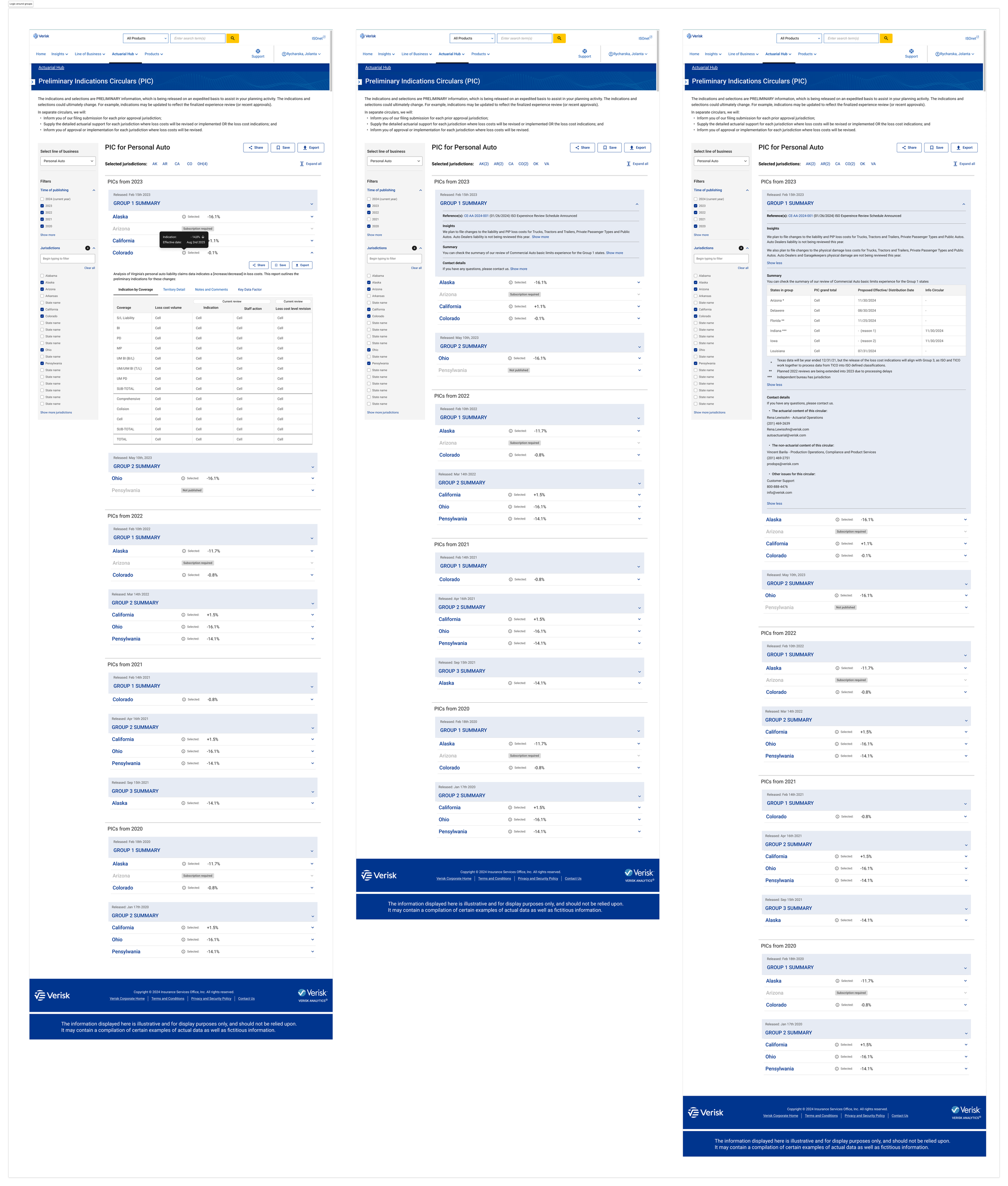
Discussion with product team resulted in decision that is worth to ask Verisk clients which aggregation method they see better. For that purpose I prepared two versions of mocks set.
Logic around groups:
Logic around states (jurisdiction):
Introducing PIC and starting point
Introducing a PIC
Starting point
Introducing a PIC
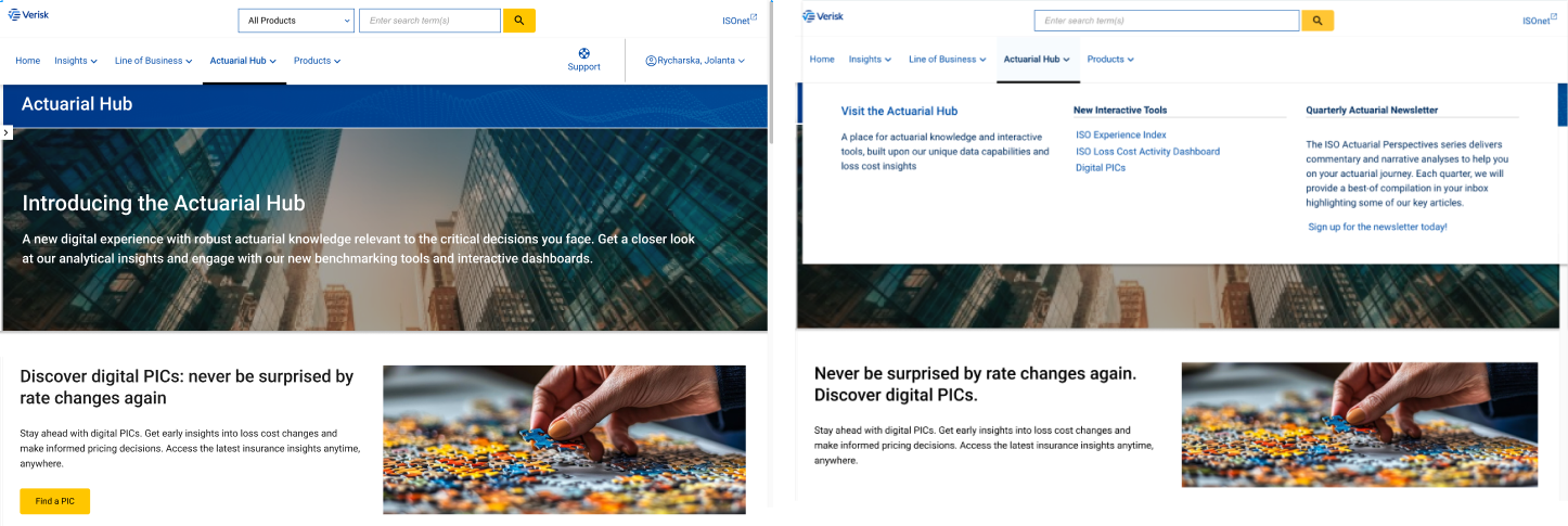
To effectively promote this new tool, it's crucial to integrate it prominently across various company platforms.
Actuarial Hub: A dedicated section for the Preliminary Indication Center (PIC) will be featured on the Actuarial Hub page, with direct access available through the main navigation bar.
Line of Business Hubs: A special section within each Line of Business Hub will provide an introduction to the PIC. From within each line of business section, users will be seamlessly directed to the PIC with the corresponding line of business pre-selected.
Starting point
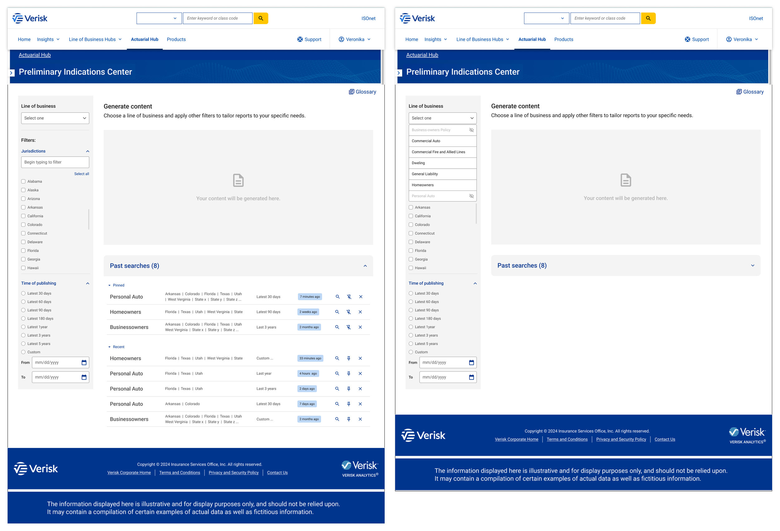
The decision of what users see after access the Preliminary Indication Center was dictated mainly by idea of speeding up his work. Difficulty here was that single user can have different profile in Verisk with different configuration of accessing to the particular line of business and jurisdiction. For the time being global approach is that user can see all content and for access only this that they have a subscription for. I decided that the best will be to display list of recent searches done under the given profile. The design process lead me to this final design.
Last verification
Interdisciplinary discussions and a detailed review of existing products led me to re-evaluate several aspects of the design. Some of my initial concerns, using Serach for vs Filtration, the most effective time filtration approach, and the keeping groups divisions in a digital environment, were addressed through collaborative discussions with the product team. We ultimately decided to retain the current approach and test it further in an upcoming usability study.
Regarding other design elements, I implemented several key changes. Notably, I reorganized the content under Group Details using a tabbed interface. This approach, mirroring the tabbed organization of content within state reports, enhances clarity and improves navigation. By utilizing tabs, all descriptive sections are neatly contained, preventing visual clutter on the main page.
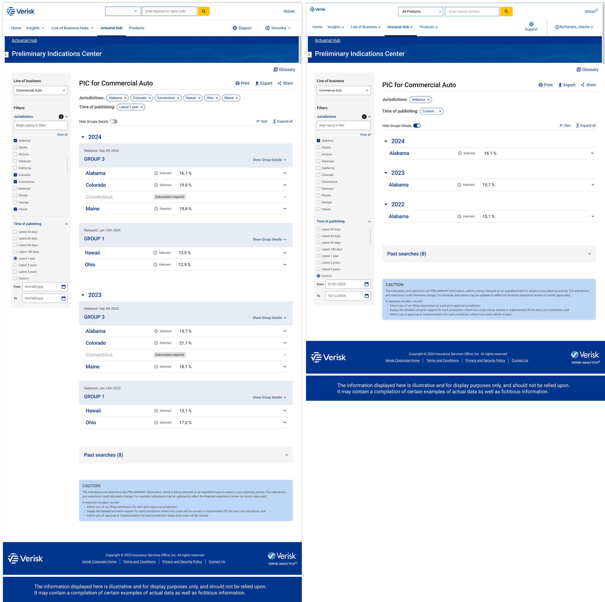
To resolved the dilemma of which logic of organization to choose, I developed a novel solution: toggle for switching off/on Group Details. Users can now observe a trend for particular state when do a proper selection on left-hand side panel and switch off Group Details cards.
Hi-Fi design and prototype
The next step was to develop hi-fidelity mocks and build a prototype. Below I am presenting several basics screens:
Usability study
A usability study is planned in the near future. This will be the first opportunity to directly engage with Loss Cost Report users and gather crucial insights. Key areas of inquiry will include:
Their experience with the current Preliminary Indication Circular (PIC).
Their current usage patterns and purposes for using the PIC.
The specific types of data they find most valuable.
For non-users, the reasons behind their lack of engagement with the PIC.
In the second part of the sessions, I propose presenting our design to the participants and conducting usability testing. While the product team currently prefers a presentation-focused approach for the UX portion, I am advocating for the inclusion of user tasks to gather more actionable insights.
Based on the outcomes of the usability study, I will implement the necessary adjustments.
Final thoughts
This project was for me a completely new challenge. From ground up I had to translate a complex, PDF-based document (the Preliminary Indication Circular) into an intuitive and user-friendly digital experience. Understanding the nuances of the existing product (PIC), including its limitations and user needs, was crucial. The research phase, encompassing existing product audits and comparative analysis with Loss Cost Reports, provided me a strong foundation for the design.
Close collaboration with the product team brought me expertise and feedback that helped me shaping the design and ensuring its alignment with user needs and business goals. I think, my design process was highly iterative, with constant refinement based on feedback and new insights. This allowed for flexibility and adaptability throughout the project.
The proposed screen flow was presented to internal stakeholders and received very positive feedback. The most gratifying aspect was witnessing the business recognize the significant value this new interface will bring to the company. I am eager to see this project implemented.

