
Overview
Goal: New design to the existing website and create e-branding
Role: UX & UI Designer, User Researcher
Tools: Pen/Pencil & Paper, Figma, Photoshop, Whimsical
Timeline: 2 weeks
Process: Research → Define → Ideate → Design
Background
My customer was looking for a new design/redesign of her professional website to increase traffic, improve conversions, and change the overall look and feel on the website.
Research and discovery
Competitive Analysis
Webpage audit
Stakeholder interview
Webpage audit
The customer’s webpage wasn’t complex. I took a closer look for site navigation, content on particular pages and visual aspect of design. My findings are as follows:
website does not have a proper hierarchy - sometimes is hard to guess when new sections start
while the website is not complex at all - architecture can still be corrected to group similar content and put it under one category
website does not effectively communicate the brand's identity and does not build credibility and professionalism
website is very monotonous - it contains only several pictures and a lot of (too much) white space
Competitive Analysis
In my competitive analysis, I was focused on websites that offer similar services: personal coaching or financial / diet advisors etc. I have seen that the majority of professional websites include:
A clear and concise statement of profession/coaching philosophy, that explains beliefs in and how you can help your clients.
A description of services (what you offer, who you work with, and how your services can benefit your clients)
Testimonials from past clients - to show potential clients that you have helped others in the past
A call to action or/and contact form to let visitors to do the next steps, eg. schedule a consultation
Some of the websites included: a blog, a portfolio, a social media feed. All pages were visually attractive with a good selection of pictures.
Stakeholder interview
After the meeting with the webpage owner, I got some other insight:
the brand is taking its first steps, so it is essential to build credibility and show professionalism around it
website should present the range of services the coach offers and recommendations about her work
website should attract new visitors and connect the coach with potential clients
reduce costs on printing flyers/brochures
Define and ideation
POV & HMW
Site Map
POV & HMW (Point of view & How might we)
I took all the research insights and needs and translated them into Point of View Statements, then from those, crafted How Might We questions for each one:
How might we establish credibility and professionalism?
We need to have a well-designed and informative website that helps to establish a coach as a credible and professional figure. This is especially important for coaches who are new to the industry or who are trying to attract new clients.
How might we provide information about their services?
The website should provide potential clients with information about a coach's services. This can include information about the coach's qualifications, experience, and areas of expertise.
How might we showcase a work?
Our website should be a great way to showcase a coach's work. Might include testimonials from past clients, case studies, and examples of the coach's work.
How might we connect with potential clients?
Our website should allow to connect with potential clients. This can be done through blog posts, social media, and email marketing
How might we generate leads?
This can be done through contact forms, or CTA buttons that allow users to schedule an appointment
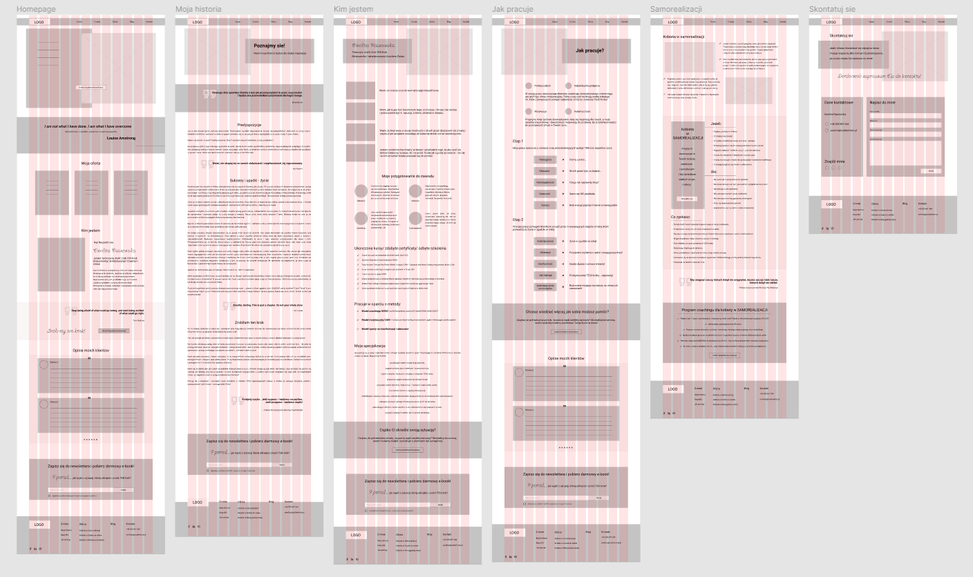
Site Map
My work I started form looking for a good website structure. My client in the future has a plan to run a blog, so altogether I was able to group the whole content into four groups, presented below.
Every single page must be built based on good visual structure to let the user easily find the proper hierarchy. The majority of the content will come from the old page. The biggest change will be on the tab About - I think having three subtopics will allow users to find what is needed at a particular moment, very easily.

Design
Wireframes
Style tile
High-fidelity screens
Wireframes
The structure of the webpage was established, and also I knew what other elements the page should contain, so I created wireframes.
Style tile
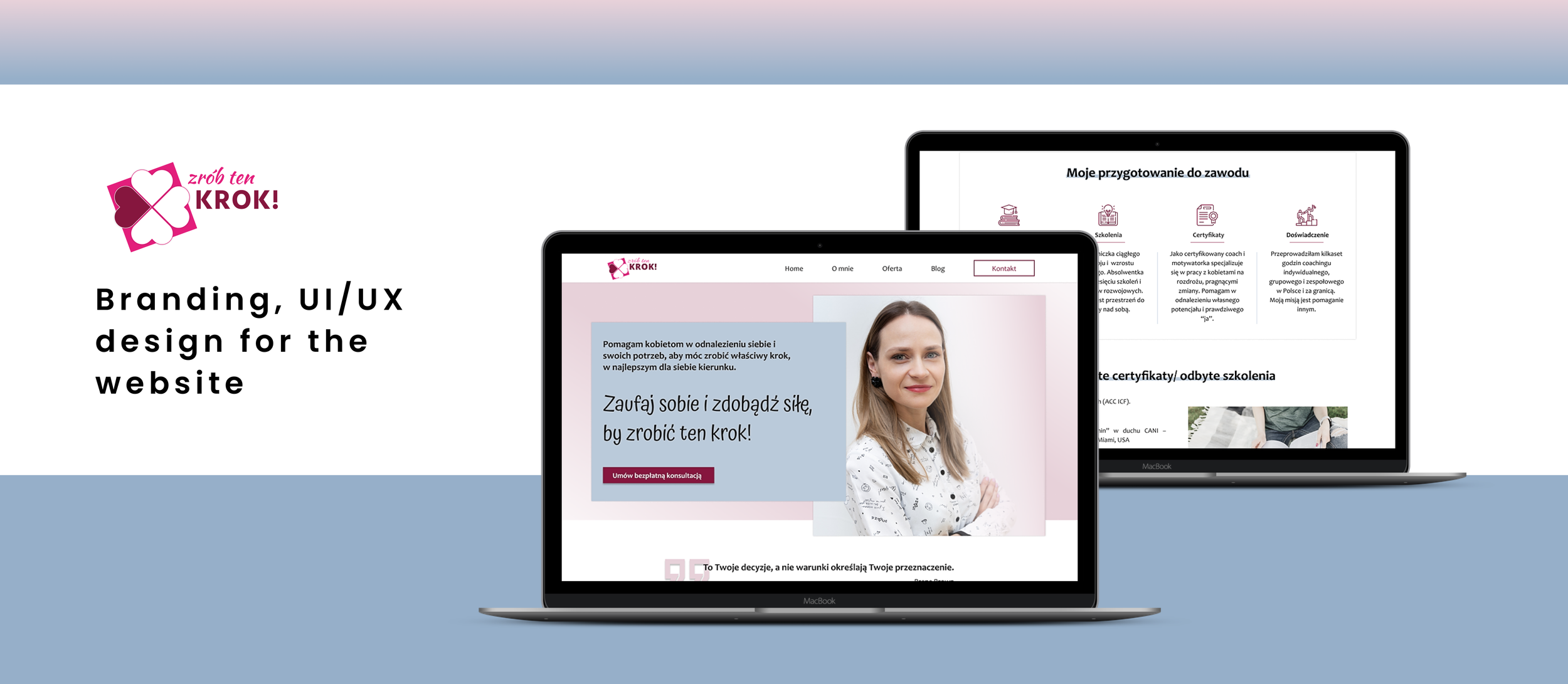
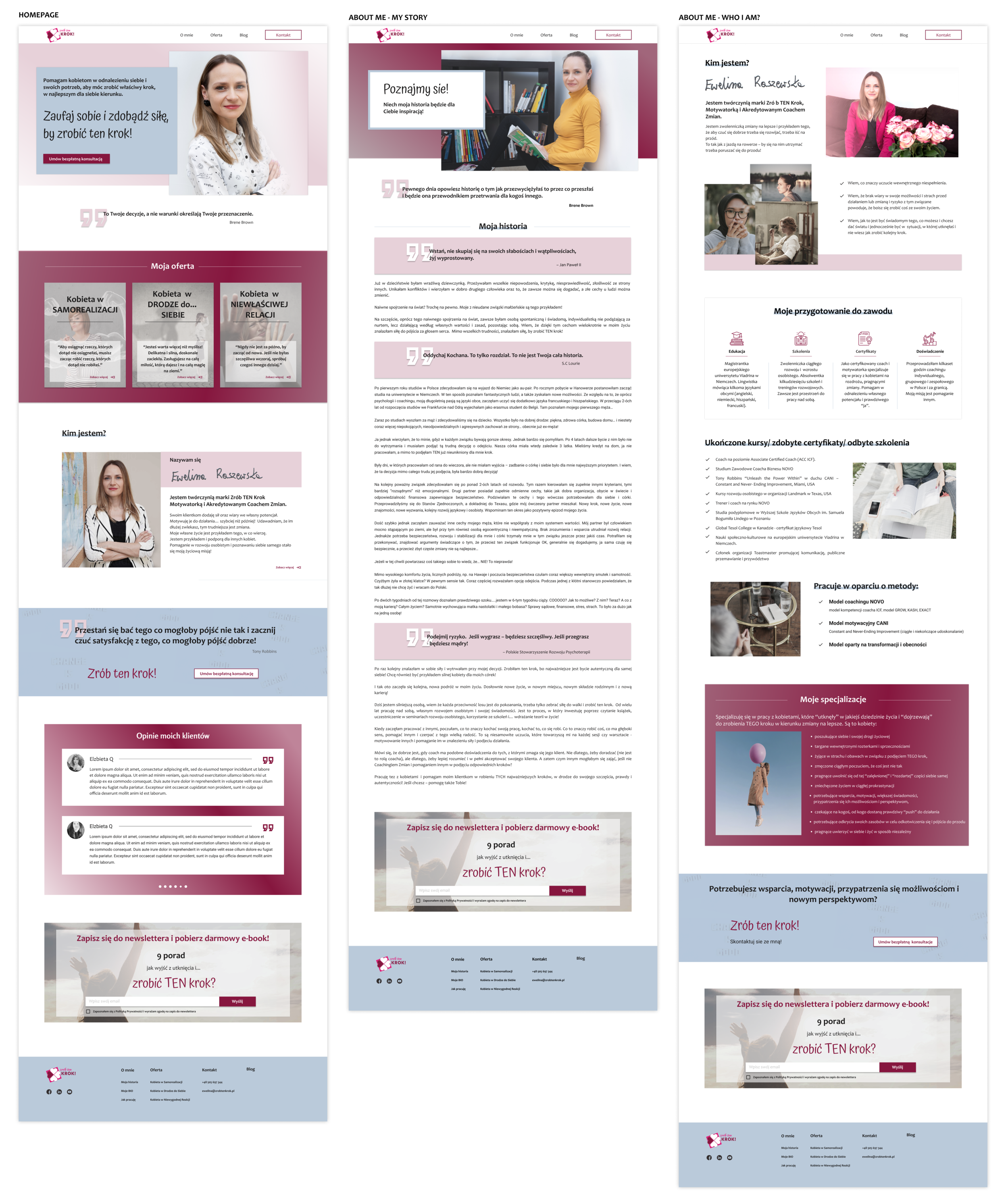
I moved on to determine the overall style and look for Zrob ten Krok! Combining notes from research, my customer expectations, and my own ideas of how I envisioned a women's coach, I decided to go for a brand feel that would encompass the words: professional, understanding, acceptance, strength & potential, and motivation. I chose a color palette that was centered around dark pink (my client's favorite color) and blue.

High fidelity screens
Wireframes were built based on the design system, so when the color pallet was chosen, I made a quite quickly high-fidelity design. Crucial was the picture selection - I spent some time looking for proper feminine imagery. The majority of pictures were adjusted in Photoshop to match the design.

Summary
This case was the first time I had to create something I didn't like 100%. I tried to gently persuade the client to a different color palette than strong pink, but I failed.
In general, the effect I achieved very well emphasizes the brand values and shows professionalism. The client was satisfied and expressed a favorable opinion.
The website was to be built in Wrodpres - I knew about this, and I know word press, so my project considered this assumption. Finally, the implementation is slightly different from the design, but the architecture and photos remain unchanged. The webpage has been working for several months and my client has received positive feedback about it.